

The Journal

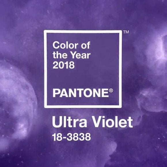
Pantone Colour of the Year 2018
Posted by Faye Butterworth on
The Pantone palette colour of the year for 2018 is Ultra Violet, it’s a complex and sometimes challenging hue, alluding to the mysteries of the night sky, the far-flung galaxies of the outer cosmos, a sense of other worldliness. Purple is a regal and unconventional colour, think Roman Emperors mixed...


Asia Olympic Influence
Posted by Faye Butterworth on
So this month the eyes of the world are on the Korean Peninsula on the eve of the 23rd Winter Olympics in PyeongChang in South Korea. Less well known than its Asian tiger competitors of China and Japan, South Korea is none the less an economic powerhouse, home to world...

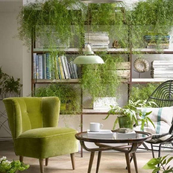
Think Green! Think Foliage!
Posted by Faye Butterworth on
With health awareness becoming ever more prominent in our everyday lives, the humble houseplant is making a comeback. In the 70’s houseplants where a must have and ironically we didn’t appreciate the health benefits they provided back then. Now finally as we appreciate them not just for their appearance but...

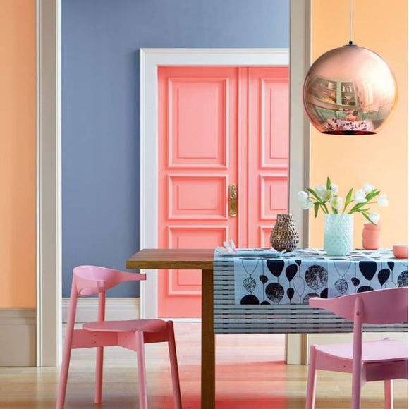
Ice Cream Tones for a Hot Summer 2018
Posted by Faye Butterworth on
Dusky pink along with mellow yellow and powdery blues are the dominant colour trends for 2018. Yet playful these pastels can add a sense of calm and simplicity to any room. Dusky pink along with mellow yellow and powdery blues are the dominant colour trends for 2018. Yet playful these...